Article · Process
The Pop-Up Book is a Hand Full. Well, Many Hands Full!
This article has previously been published in both Bound & Lettered and Book Arts arts du livre Canada magazines.
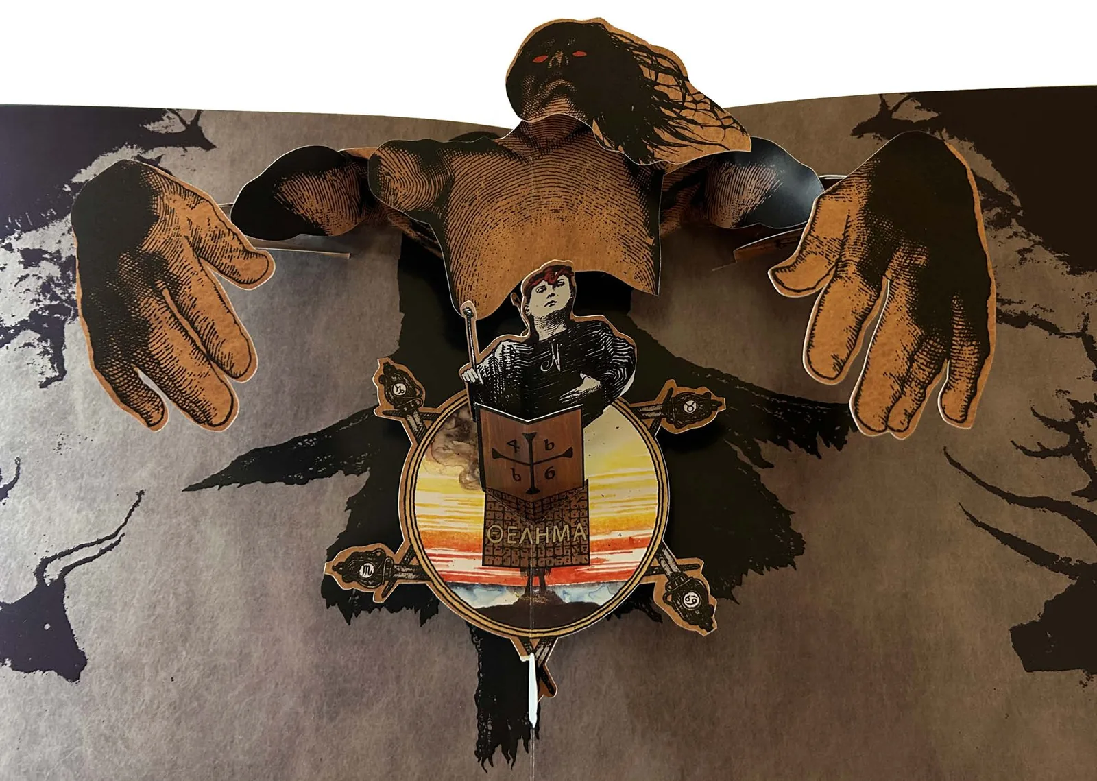
Every pop-up book is a hand-made book.
It matters not if there is only one copy ever made, or if there are hundreds of thousands of duplicates. Each is still…HAND-made.
Unlike most hobbyist or artist hand-crafted books where only one or just a few books are created, pop-up books are produced commercially in the thousands, even as many as three hundred thousand. Like artists’ hand-crafted books, all pop-up books begin as a hand-crafted book. And then each and every copy is as well. There is no machine that can adapt or have the finesse necessary to mass produce them. So how DO they come into being? We can thank the paper engineer.
True story. Many years ago while on a flight across country, the passenger in the seat next to mine looked up from the book she was reading and struck up a conversation. She asked what I did for a living. I told her I design pop-ups! She paused for a moment, and hesitatingly replied, “I don’t mean to be rude, but honestly I really hate all those little windows opening on my computer”. No no no, I interjected. Not THAT kind of pop-up! I’m a paper engineer. “So you work for a paper mill designing papers?” Chuckling, I corrected her. “No, I design paper structures in books. Sort of like paper dolls. I actually play with them for a living.” Looking at me in a kind of stunned silence, she opened her mouth to speak, closed it, and then returned to her book from which she did not look up for the rest of the flight.
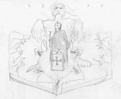
Play, in this case, is of course, a euphemism for open, creative exploration. Experimentation, trial and error, problem solving, and artistic expression are also apropos terms. With experience, intuitive solutions may come faster, but the openness and willingness to experiment nevertheless is the key to successful art, whether that be a musical arrangement, a riveting novel, or an amazing and unexpected pop-up!
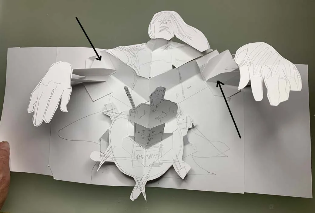
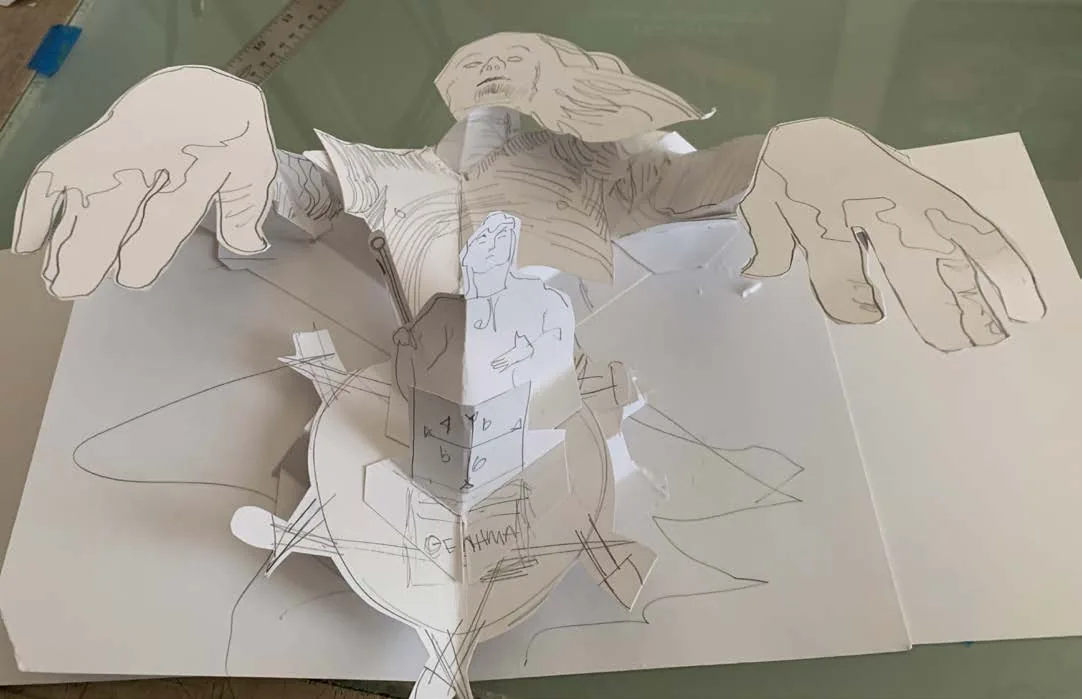
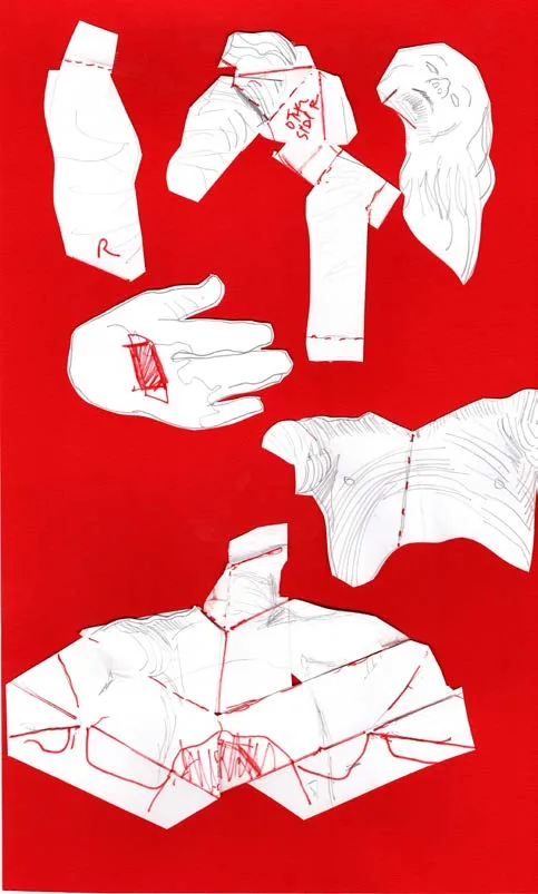
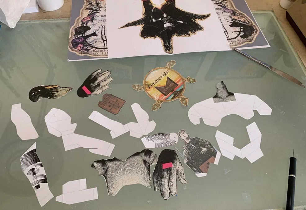

The stages of designing a pop-up. From a pencil sketch or other reference, a rough cut is built, exploring and adjusting the design. A second, third, or even fourth version is built and refined, combining mechanisms whenever possible for efficiency. Then the pop is disassembled and the pieces scanned. Die lines are created in Adobe Illustrator, art is inserted into the die lines, printed, hand cut, and a more complete version is built. Further refinements are made, artwork is completed, and a final hand made copy is constructed.
So what is a Paper Engineer? They are artists. Artists who delight in making flat paper behave like sculpture in motion. Similar in many ways to origami, there are indeed notable differences. Origami results in a static sculpture, frozen into its multi-faceted, complicated, but realized form. A pop-up, however, transforms each and every time it is activated. It is flat, it is formed, it is flattened, over and over again. Origami most often uses a single piece of paper in its entirety, uncut. A pop-up, by contrast, is built of many intricately cut pieces assembled into a new structure with glue or locking mechanisms. Origami results most often as an object. Pop-ups, however, combine sculpture, theatricality, pacing, and innovation to tell a story much like a stage play does, or presents an object that morphs magically into three dimensions from a flat page and then returns to that flat form as the page is turned. Sometimes, with the interaction of the reader, the engineering even reveals art that moves and animates. For me, my favorite pop-ups are ones that in some manner find a way to dance into its solution.
Let me share an anecdote I was once told. The difference between western and far eastern water fountains, the speaker proposed, reflects this difference in paper engineering as well. The eastern approach to fountains allows the water to flow naturally. Trickles, waterfalls, drips, in all a respect for the inherent nature of the material. But western fountains force water to yield to the will of the designer. Shoot the water upward into the air. Defy gravity. Spray the water, divert it. The eastern art of origami respects and shows deference to the innate properties and spirit of the material. Using a single piece of paper many folds but rarely is cut. Paper engineering on the other hand, reshapes the paper, cutting, slicing, punching holes and uses many pieces of paper to make its forms. Then reforming the pieces with glue or other bindings into its new form demanded by the artist.
There are only a few people at any given time around the world who are professionally engaged in this art form. Usually no more than a couple dozen. The cast may revolve, but the numbers remain small. I cannot attest to how other paper engineers approach a project, only to my own. Perhaps it is the same…
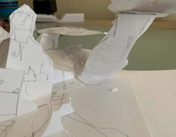
My projects start in a number of ways. Sometimes it is nothing more than a line of text, up to me to completely envision. Sometimes it involves images of the necessary components like a list or manifest but with no clear direction for its solution. Many times I work with other illustrators, chosen for their style and skill. In these cases often sketches are offered, or at least elements they wish to explore. In each of these, I try to imagine a solution that checks as many boxes as possible. Can I find a way to make the final form a realistic or satisfactory facsimile of the inspiration? Is there an action that would inform or elevate it further? Does the story describe a moment to emulate? Should the pop-up be the defining moment of that passage or a transition? And after all that, can I find a way to make it accomplish all this in a way that is elegant? Surprising? Is it dancing?
“No matter how complicated an action or structure appears to be, every pop-up book is entirely created from just a basic assortment of paper folds and devices, creatively combined in various imaginative ways to capture the spirit of a particular piece of art or composition,” as described by paper engineer Andrew Baron. (http://www.popyrus.com/paper.html)
Sometimes I have only a vague idea of where the pop-up might go. At other times I can see it whole and in experimenting, try to find ways to improve that vision. But ALL of them start loose, rough, undefined. This allows room for change or the unexpected discovery, but also doesn’t use a lot of time refining shapes too early as they may change anyway. My studio paper is WestRock™ Tango, 231 gsm, 12 point, coated one side only so the ink from my ink jet printer will adhere. The ink will pool up and smear on a coated side. It is similar in specifications to the stock that the printer will eventually use, but beyond that we have very limited input into what that paper will be: whatever they can get that still meets the specifications. Especially in China, paper choices are extremely limited, no brands or trademarked papers unlike in the west where there are virtually limitless options.
I cut the paper with scissors and x-acto, but only its broader shapes and size. Double sided tape allows quick positioning and re-positioning as needed. Is the piece sitting on too much of an angle? Pull it up and tilt it a bit. Scraps of paper lengthen, reshape. Add on levels, glue on mini structures, perhaps a pyramid along that fold. No, point it in the other direction. Later anything that works will be incorporated into the final.
At last, a rough, yes even ugly, form takes shape. I imagine its shapes as they WILL be. Movements that need tweaking. Photograph this model from several angles for reference later, maybe a movie, as this one will not survive. Marking all the positions, drawing lines along any and all folds, the pop is dismantled and flattened out. Backing the pieces on my scanner with a contrasting sheet, red perhaps, I can now see all the shapes, all the folds, all the positions. Well, sort of.
Importing the scans into my Adobe Illustrator document, I lock that layer and begin drawing the die lines and folds on their own layers. Deleting the scans, print the pieces, hand cut the shapes, score the folds and build a second model. Surprising. Some of the pieces are not correct. Ah, need to remeasure that lift or adjust that angle. Make the changes in the Illustrator document. Print, cut and build a third time. Better. Hmm. What if I add something here? MUCH better!
One of the hallmarks of artist’s hand-made books is the creative use of multiple papers, fabrics, other bindings…even thread. But that is not the case with printed pop-up books. The paper is the same throughout as the printed sheets are large (28” x 40” is the norm) and all pieces are cut from this. Any texture, color, finish must be applied to this standard sheet, whether that be embossing, varnishes, or foil. The printer’s sheet that houses all the pieces is called a nesting sheet. A pop-up book will require from 1 to upwards of 10 or more of these. The size of the book, the complexity of the engineering, both contribute to how many sheets will be necessary and drastically affects its cost. First, the amount of paper used is a major factor. Larger books of course, need more paper. Complexity adds cost in two ways: the steel dies are larger and more abundant; and every spot of glue or hand folded piece means more interaction and time in assembly.
Finally, after I am convinced the pop-up is where I want it to be, I can provide the templates to the illustrator or input artwork that already has been provided. Once installed on its own layer, another print, hand cut, and assemble to check the pop, to review the way the art reassembles. Adjustments are made if necessary and a pass to make sure there is at least 3/16” bleed around every piece, otherwise, there could be unwelcome unprinted white paper showing after the cuts. On another layer, indications of where the glue will go are input. The printer will have final adjustments to these areas, but it is important that the ink is not allowed on these spots for best results of the glue. We call these K/O’s or “knock-outs”. And off to the printer all of this work goes: a color model, the files, any instructions if needed.
From there the printer also hand-cuts (or in some cases, uses a plotter) to cut out and assemble a working model. Most often these are still white, but sometimes digitally printed. And then after approvals, the process begins again. Teams are convened to address a single spread from the book, each member assigned only one or two steps. Sometimes there are over a thousand people working on the same book. But all contribute to the accumulating completion of the book. All by hand. One. Piece. At. A. Time. And then eventually the book finds its way to the reader to discover and play.

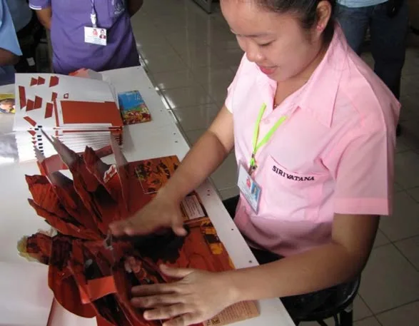
The phenomenal Prince of Pop, Robert Sabuda, would often say in his appearances, (as I paraphrase) “the pop-up book passes through many hands. From my hands to the printer’s hands, to the reader’s hands. We all make the book come alive.”

About the author
Bruce Foster
Bruce Foster is a paper engineer, designer, writer and speaker based in Cypress, Texas, in the Houston area. He has designed the pop-ups for more than 70 published pop-up books.
Commissions and bookings
Have a pop-up in mind?
Tell me what you have in mind, large or small. I can handle your project from end to end: concept, collaboration, design, press-ready production, and coordinating with the printer, yours or mine.